Well it is certainly the offseason. All the Ohio State boards are flooded with complaints on the recent unveiling of new uniforms.
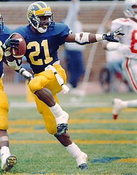
Most of you might not even notice the change, but I find it funny that there are nothing but "New Jersey" threads on all the OSU message boards (most of the reviews are pretty negative). I believe Michigan made the change last spring, and there was some upheaval over that as well.
Just goes to show you how old-school some fans can get. And how Nike is doing anything it can to sway even the most traditional schools to make some tweaks. PSUFAN, wasn't there a huge outcry when Penn State first donned the threads with the Nike Swoosh on them?
“My dentist, that’s another beauty, my dentist, you kiddin’ me. It cost me five thousand dollars to have all new teeth put in. Now he tells me I need braces!” —Rodney Dangerfield
LB45 wrote:Just goes to show you how old-school some fans can get. And how Nike is doing anything it can to sway even the most traditional schools to make some tweaks. PSUFAN, wasn't there a huge outcry when Penn State first donned the threads with the Nike Swoosh on them?
What's the difference? Honestly. Are the stripes moved a little bit? The UofM uni, when not worn by the player, looked like it had a giant diaper on it.
"Well, my wife assassinated my sexual identity, and my children are eating my dreams." -Louis CK
L45B, I wouldn't say that the outcry has huge...it just folded in with the mid-volume static that is always there anyway. On the PSU boards, there's always a few uni threads going on...a newer poster will ask something about a uni change, and lots of folks crack him and feel good about themselves.
King Crimson wrote:anytime you have a smoke tunnel and it's not Judas Priest in the mid 80's....watch out.
The same thing happened in Ann Arbor and once they wore them out on the field no one noticed the difference. They just look strange up close, but everything will be just fine come kickoff.
I'll admit, I hated the way I thought the new Michigan jersey's looked last year, but once the players had them on they looked like they always have.
Some people are opposed to change for the sake of being opposed to change.
They look okay...Nike just likes messing with the design of the actual jersey themselves. They pissed off a lot of hockey fans for what they did with uniforms for the teams in the Olympics. I guess they want to revolutionize the way a jersey is made. Frankly I don't know how much of a difference these alterations mean in a player's performance.
The only thing different I can see is that the silver/grey looks to be gone from the stripes.
Apparently we are finally having Nike manufacture our uni's this year. I kind of liked the new ones we used last season, so I hope there isn't uch change.
MuchoBulls wrote:
Apparently we are finally having Nike manufacture our uni's this year. I kind of liked the new ones we used last season, so I hope there isn't uch change.
I like the old unis better...and glad Carroll told Nike to pound sand with those hideous jerseys that a few teams wore last year with the different-colored arms.
DeWayne Walker wrote:"They could have put 55 points on us today. I was happy they didn't run the score up. . . .
Killian wrote:What's the difference? Honestly. Are the stripes moved a little bit?
The most significant change was the new ventilation fabric (just in time for that trip to Austin). What's got most tOSU fans' pannies in a knot is the stripe design was changed to match the stripe on the helmet and pants. Most are complaining that it's a break from tradition, however, during the Earle Bruce days (1979-88) the jersey made the same change.
I'm not all that upset about it. The replica jerseys look terrible-- that was the initial reason for all the complaining. Nike lowered the numbers on the sleeves-- they look like those shitty rags worn by Nebraska & Wisconsin .
But the authentics look okay. The numbers will still be embroidered (stitched on) which I think is a necessity for the sake of class (stab at Texas fan).
Last edited by L45B on Thu Apr 06, 2006 6:11 pm, edited 1 time in total.
“My dentist, that’s another beauty, my dentist, you kiddin’ me. It cost me five thousand dollars to have all new teeth put in. Now he tells me I need braces!” —Rodney Dangerfield
Believe the Heupel wrote:I don't give a shit what anyone does with their jerseys as long was we don't EVER use the Schnellenberger jerseys again. Fuckin' hideous.
What'd they look like? Seems to me OU's unis are pretty basic -- hard to fukk them up tremendously.
War Wagon wrote:The first time I click on one of your youtube links will be the first time.
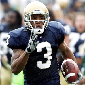
As for ND's, I'd like to see us get rid of the numbers on the sleeves. Either move them up to the shoulders, or eliminate them entirely. And put an interlocking ND on the sleeves.
Also, go back to white shoes.
War Wagon wrote:The first time I click on one of your youtube links will be the first time.
^^BTH, tell me that OU doesn't still wear those pants.
“My dentist, that’s another beauty, my dentist, you kiddin’ me. It cost me five thousand dollars to have all new teeth put in. Now he tells me I need braces!” —Rodney Dangerfield
Shawn Marion wrote:Scarlet and gray with no gray... Stupid.
That's the point right there, no fucking gray on our scarlet (red) uniforms. We have bastardized this uni so much, I don't care anymore. I guess if they look OK on the field it doesn't matter that much.