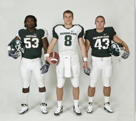
Definitely not a fan. With the Dantonio regime came a simple, sharp uniform that everybody loved. And now this shit. Ugh. But he wasn't going to be able to stand in the way of what was a universal branding process that the athletic department rolled out with this spring. Across all sports there were different logos, fonts, and shades of green being used. They wanted to make everything (more) uniform, and in the process, the football unis had to take a hit with the Nike ugly stick. I like the basketball unis, though I wouldn't call them an upgrade. I liked the block "State" on the front.

As for the football unis, the one you see on the left that Greg Jones is wearing (#53) is the alternate. #43 on the right will be the standard home jersey, which is basically what they had before. So it's not all bad. The AD also wanted to change the design of the Spartan head logo, but there was so much backlash from the fan base when they rolled out the new design that they backed off. So apparently instead of an all out buttfucking they just decided to stick in the tip.
Oh well. At least now it'll be an even bigger slap in the face to MichiganFan when they roll into AA and take care of business.