Page 1 of 1
more hahahahahaha michigan state
Posted: Sun Apr 25, 2010 1:11 pm
by M Club
nice uniforms.
i like the title of
this blog post:
Congratulations, Everyone: Those $9.99 Jerseys You Bought at Steve and Barry's 5 Years Ago Now Look More Authentic Than You Ever Could Have Imagined
for the reals, though: i feel bad for you guys having to root for a team with a shitty [whoever decides on the uniform design] department. the new look every year predates even nike, so it's not like you can use that as a scapegoat. at least adidas has left our home uniforms alone.
Re: more hahahahahaha michigan state
Posted: Sun Apr 25, 2010 1:41 pm
by King Crimson
among the BCS schools, Sparty sure does seem to change a lot. the "S" to the "Spartan helmet guy" and back on the head-gear seems to have a cycle as well. Arkansas changes a lot these days....vacillating between the classic hog on helmet, crimson uni, white pant to some serious Tron-ass stuff.
Re: more hahahahahaha michigan state
Posted: Sun Apr 25, 2010 2:27 pm
by Screw_Michigan
Yep, those are pretty disgraceful. These take the cake:

What an abortion that home hockey jersey is. And STOP NAMING YOUR GOALIES CAPTAINS!
Re: more hahahahahaha michigan state
Posted: Sun Apr 25, 2010 2:52 pm
by WolverineSteve
Jesus!!! The Oregon of the midwest!! Can they please sneak a couple more swooshes on the hockey uni's. Nothing is sacred with those U&L fucks. I swear they sit back and laugh at the shit they get some schools to wear. And is that the "new" green?
Goddamn state, a tradition of mediocrity is not concealed by more uniform changes than a Elton John show.
Dins should be by shortly to school us on how Nike's got bode.....

in 3,2,1,....
Re: more hahahahahaha michigan state
Posted: Sun Apr 25, 2010 4:20 pm
by Mace
At least these unis have deflected some of the laughter away from Ann Arbor.
Re: more hahahahahaha michigan state
Posted: Sun Apr 25, 2010 4:30 pm
by MgoBlue-LightSpecial
Why the insecurity?
Re: more hahahahahaha michigan state
Posted: Sun Apr 25, 2010 4:37 pm
by MgoBlue-LightSpecial
Definitely not a fan. With the Dantonio regime came a simple, sharp uniform that everybody loved. And now this shit. Ugh. But he wasn't going to be able to stand in the way of what was a universal branding process that the athletic department rolled out with this spring. Across all sports there were different logos, fonts, and shades of green being used. They wanted to make everything (more) uniform, and in the process, the football unis had to take a hit with the Nike ugly stick. I like the basketball unis, though I wouldn't call them an upgrade. I liked the block "State" on the front.

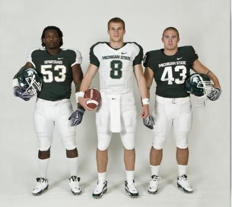
As for the football unis, the one you see on the left that Greg Jones is wearing (#53) is the alternate. #43 on the right will be the standard home jersey, which is basically what they had before. So it's not all bad. The AD also wanted to change the design of the Spartan head logo, but there was so much backlash from the fan base when they rolled out the new design that they backed off. So apparently instead of an all out buttfucking they just decided to stick in the tip.
Oh well. At least now it'll be an even bigger slap in the face to MichiganFan when they roll into AA and take care of business.
Re: more hahahahahaha michigan state
Posted: Sun Apr 25, 2010 4:39 pm
by Screw_Michigan
Marketers deserve to be dragged into the street and shot.
Re: more hahahahahaha michigan state
Posted: Sun Apr 25, 2010 5:10 pm
by King Crimson
losing the block "state" is a bad move on the hoops uni. that was a signature look.
Re: more hahahahahaha michigan state
Posted: Sun Apr 25, 2010 6:10 pm
by MgoBlue-LightSpecial
King Crimson wrote:losing the block "state" is a bad move on the hoops uni. that was a signature look.
Yup. The whole point of this was to create a branding "identity." That's tough to do when you've eliminated what was already identifiable, and when you're doing it every five years. Nobody really cares if the basketball uniforms are in line with cross country and rowing.
Re: more hahahahahaha michigan state
Posted: Sun Apr 25, 2010 6:32 pm
by King Crimson
MgoBlue-LightSpecial wrote:King Crimson wrote:losing the block "state" is a bad move on the hoops uni. that was a signature look.
Yup. The whole point of this was to create a branding "identity." That's tough to do when you've eliminated what was already identifiable, and when you're doing it every five years. Nobody really cares if the basketball uniforms are in line with cross country and rowing.
seems kind of like the opposite. the "State" was a brand identity/logo. now, sounds more like the switch em up every so often (probably the object of some marketing research to determine optimal returns)....so, Sparty fan feels compelled to buy the new stuff every time. Colorado has gone through a similar version of this in the last few years. "refit" and "updated" the logo and let Nike deliver one of the most confused, ugly ass home unis around when CU had a classic, clean look that was among the best (imo, even before i was in grad school or working at CU) for the last 25 years. now, they just look dumb.
Re: more hahahahahaha michigan state
Posted: Sun Apr 25, 2010 11:07 pm
by M Club
MgoBlue-LightSpecial wrote:Why the insecurity?
because all of this chatter about msu surpassing umich as the dominant football program in the state, not to mention our own nasty road uniforms. turns out even a couple losing seasons at michigan can't keep state from sticking to their philosophy of 'same old sparty.'
Re: more hahahahahaha michigan state
Posted: Sun Apr 25, 2010 11:23 pm
by MgoBlue-LightSpecial
What, have you been reading the Red Cedar Message Board? We may have to settle this with a bout of drunken Whirlyball.
Re: more hahahahahaha michigan state
Posted: Mon Apr 26, 2010 2:19 am
by Shoalzie
Why do they do this every few years? They've got a nice classic look...why tweak it so often?
Re: more hahahahahaha michigan state
Posted: Mon Apr 26, 2010 2:24 am
by Screw_Michigan
Shoalzie wrote:Why do they do this every few years? They've got a nice classic look...why tweak it so often?
Little bro syndrome.
Re: more hahahahahaha michigan state
Posted: Mon Apr 26, 2010 2:45 am
by TheJON
Yeah, I don't know why MSU is changing their uni's. The ones they've been wearing the last few years were some pretty good ones. These ones are not.
I hope Iowa keeps the Steelers copy uniforms as long as I'm alive. In 1994-1995 we switched to these gay ass uni's that didn't go over well and so they switched back. Maybe MSU will do the same.
I agree on the hoops uni's too. Why would MSU go to something different? "State" on the front was really something that could have been a staple for the next 50 years.
I didn't like when tOSU switched to the newer home uni's a few years back. Always loved the old ones. Same with Michigan last year. Why ruin a tradition like that?
Alabam, on the other hand, needs to get rid of those 1920's looking jersey's. Jesus christ, those fucking uni's are god damn horrible despite tradition.
Re: more hahahahahaha michigan state
Posted: Mon Apr 26, 2010 3:10 am
by M Club
MgoBlue-LightSpecial wrote:What, have you been reading the Red Cedar Message Board? We may have to settle this with a bout of drunken Whirlyball.
i'm like a moderator or something there. whirleyball's a good idea, though i prefer we settle it the traditional way: where we brag about our 7-5 record while you won't stfu about your 5-7 because one of those wins was against us.
Re: more hahahahahaha michigan state
Posted: Mon Apr 26, 2010 3:13 am
by M Club
MgoBlue-LightSpecial wrote:Across all sports there were different logos, fonts, and shades of green being used. They wanted to make everything (more) uniform, and in the process, the football unis had to take a hit with the Nike ugly stick.
seems to me they should have used the football team as the standard for uniformity. also, it seems as if your bball team switches uniforms every year, non? i see the reasoning (though bad) with the football team trying to gain traction, but kind of odd for all the success your bball team has had.
Re: more hahahahahaha michigan state
Posted: Mon Apr 26, 2010 3:19 am
by Screw_Michigan
Bball team has worn the same jerseys since 00-01, the Jason Richardson-Zach Randolf era.
Re: more hahahahahaha michigan state
Posted: Mon Apr 26, 2010 3:32 am
by TheJON
Screw_Michigan wrote:Bball team has worn the same jerseys since 00-01, the Jason Richardson-Zach Randolf era.
Good 'ol Zach Randolph! Now that's a classy guy! 20 kids and a committed a felony for each one of them.
Re: more hahahahahaha michigan state
Posted: Mon Apr 26, 2010 3:57 am
by M Club
Screw_Michigan wrote:Bball team has worn the same jerseys since 00-01, the Jason Richardson-Zach Randolf era.
really? for some reason i thought they switched them up rather frequently. whoops.
even if they did, at least they'd never done denim a la kentucky.
Re: more hahahahahaha michigan state
Posted: Mon Apr 26, 2010 1:14 pm
by MgoBlue-LightSpecial
I'd say you're both partially correct. Although they had the block "State" on the jerseys since the early 00s, they had tweaked the overall design/functionality of the uniforms frequently since then.
Re: more hahahahahaha michigan state
Posted: Mon Apr 26, 2010 4:19 pm
by Dinsdale
TheJON wrote:
Good 'ol Zach Randolph! Now that's a classy guy! 20 kids and a committed a felony for each one of them.
Not true... he bought his way out of at least 19 of those. Dude's so slick, his dogfighting ring is still alive and well in Oregon.
Sin,
Don't Bring That Name Up Around Blazer Fan
P.S.: Mateen Cleaves just got himself a DUI
Re: more hahahahahaha michigan state
Posted: Fri Apr 30, 2010 2:53 am
by Danimal
I'm not a fan of Nike, they have a history of very sleazy labor-practices and jacked-up unis. That said, I rather like MSU's new look. Think they're pretty sharp.